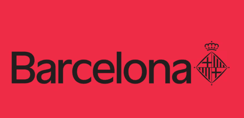
In 2025, Barcelona decided to radically renew its visual identity. After fifteen years of using the previous branding, city authorities introduced a new logo that will now accompany all official communications. The main change is the removal of the familiar word “муниципалитет” (ayuntamiento) from the official emblem. Now, the logo features only the word “Barcelona” and the official city coat of arms, which has moved from the left side to the right.
The design was created specifically for the Catalan capital by the Principi studio. A unique font was developed for the new branding: it is lighter, more refined, and modern, which is immediately noticeable. The color palette remains true to tradition—red and white, as well as black on a red background. However, the background has now been removed, making the logo lighter and more versatile for different applications.
City authorities explain that this step is aimed at strengthening the connection between the city administration and residents. The new visual language is intended to make communication more open and bring the city closer to its people. Dropping the word “муниципалитет” highlights the intention to foster informal and modern communication, as well as the desire to avoid excessive formality.
The updated logo will be used on all official documents, signage, transport, and digital platforms. This approach allows Barcelona to stand out among other cities in Spain and Europe, emphasizing its unique identity and innovation. The city continues to follow global design trends while maintaining respect for its historical symbols.